Idea
On the wave of popularity of creating local marketplaces, the Customer came up with the idea of doing something similar for his own sphere: beauty salons and hairdressing salons. He knew that masters (hairdressers, masseurs, manicurists, etc.) have their own “pains”:
- Goods from different suppliers have to be ordered from different places.
- You can buy everything at once in an offline store, but you have to go there, and the price will be noticeably higher.
- To find out the price and availability of goods, you have to request information through managers.
- It is necessary to collect an order for the minimum purchase amount from each supplier.
“Matur Market” plans to solve these problems and simplify the procurement of masters in the beauty industry.
Matur translates from Tatar as “beautiful”. The startup was invented and launched in the Republic of Tatarstan.
Unlike the usual marketplaces, Matur Market does not involve a seller’s office. This is explained by the peculiarities of the sphere: if we want to offer buyers the most favorable price, we need to cooperate with a supplier or an official distributor, which is usually one for the entire region. Therefore, there will be no competition for the sale of the same goods. This option is convenient for everyone:
- Buyers: there is no need to search for the most favorable price, on the site he immediately sees the best offer.
- Sellers: the service takes care of loading goods into the catalog.
- To the service: the development of an additional cabinet would increase the launch time and development cost.
So, we needed to make an MVP – a product with the minimum functionality required to test the Customer’s hypothesis.
Problem
Before starting the MVP development, the Customer talked to several product suppliers and obtained preliminary agreements. It was important to launch the service as soon as possible so that potential partners would not lose interest.
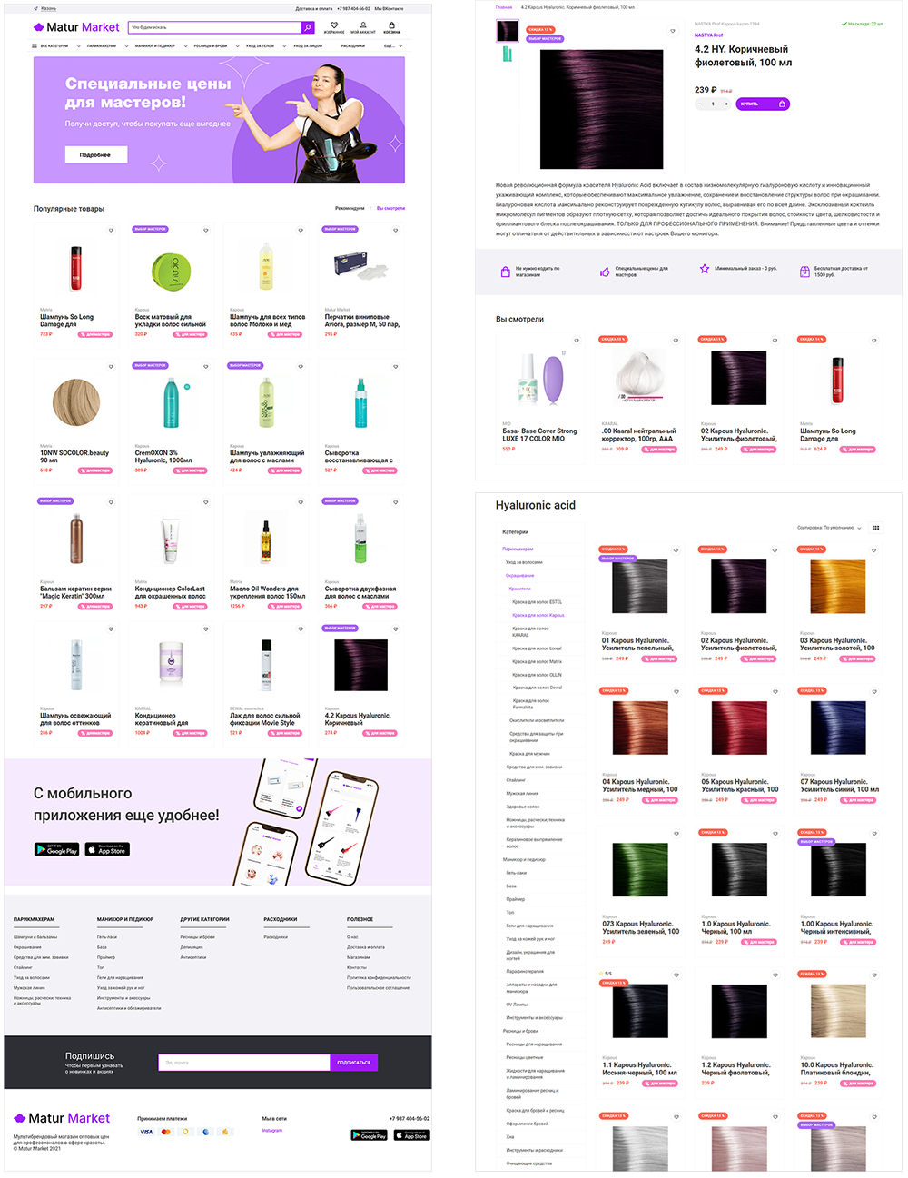
But at the same time, there are certain functional requirements from the customers: users who are used to online shopping expect to see a catalog, division into categories, search, product description cards, shopping cart, order placement, different payment options, and view the status and history of orders.
To combine the wishes and tight deadlines, we proposed the following implementation option:
- Make an online store site on the OpenCart platform. Such a solution can be realized quite quickly because it is made on the basis of CMS. Plus, OpenCart has a good admin panel for working with orders, loading products, creating categories, customer management, and many other features that the customer has not even thought of yet but may be needed in the future.
- Further “pack” the site into a mobile application using web-view pages.
The deadline of 30 calendar days was set, and it was impossible to fail: the launch date was announced on social networks and to suppliers.
Solution
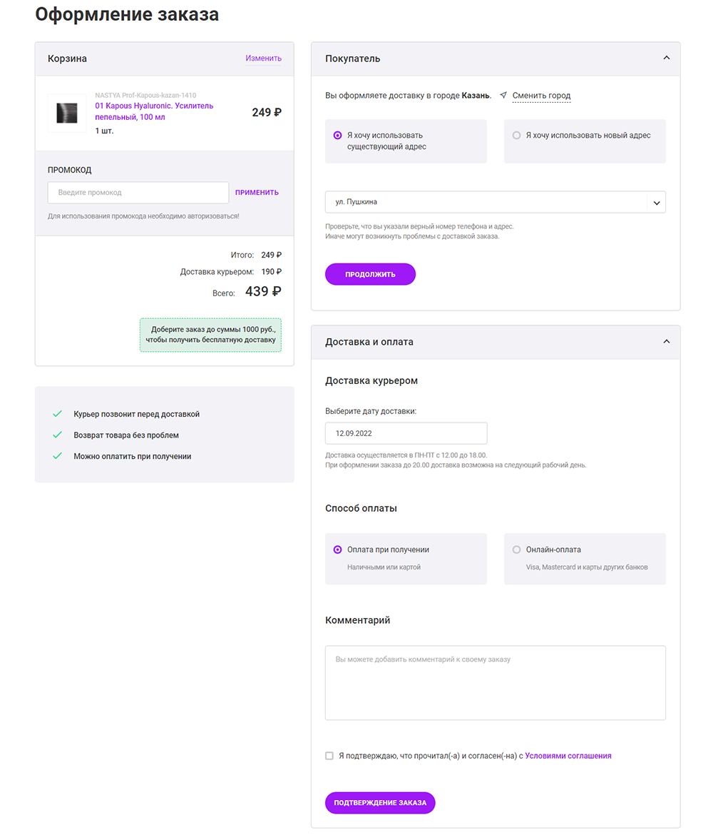
The basic functionality of the site was deployed “out of the box”, but it was necessary to work out the design, prepare banners, and implement logic that is not available in the basic version, for example: determining the location, displaying the necessary products in the right city, selecting the delivery date when ordering, and different delivery costs for different amounts and areas. The admin panel was also finalized: we made a mass upload of goods by Excel-file, as well as integration with the sites of suppliers and integration with retailCRM.
The first testing by real customers showed that users had difficulties with the purchase: more than 60% left the site without completing the order placement. Therefore, it was decided to work on the UX of this form: reduce the number of fields, add hints, and make the interface more understandable and attractive. The result was not long in coming: a month later, the number of abandoned baskets was already less than 40%.
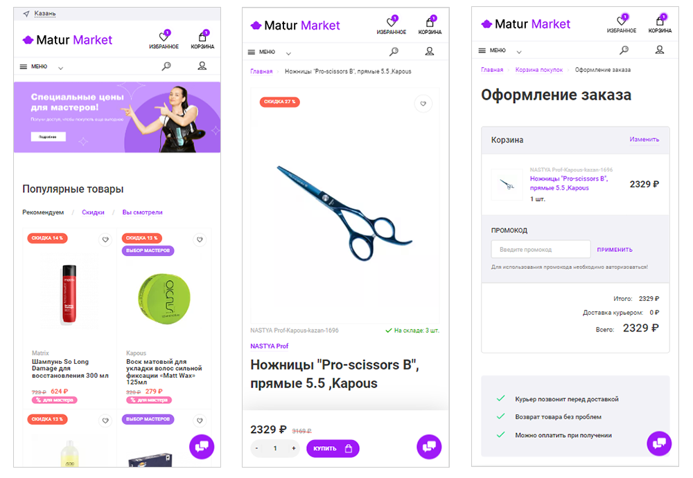
The Android app looks similar to the mobile version of the site.
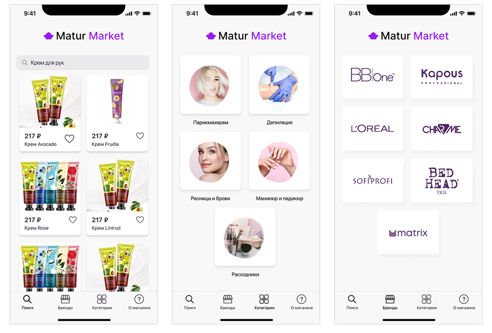
But for iOS it’s a bit different: there is a lower menu and additional pages, but the home page is absent. The App Store does not allow applications that completely duplicate the appearance and functionality of the site.
Summary
The service was deployed on the server and launched within the set deadline, mobile applications were published in stores. The chosen solution allowed for the first sales from the mobile application a month after the application was launched. Of course, MVP has its limitations in terms of available functionality, but it allows testing a startup idea with little time and money.


