Task
To develop a web service where future newlyweds can address all wedding planning questions in one place: find original ideas, helpful advice, verified specialists, and plan the celebration.
Problem
When solving the task, it is necessary to implement features for different types of users:
- Access to general content for unauthenticated users,
- Personal account for the bride/groom to store useful information,
- Personal account for organizations (specialists) to publish their services on the platform,
- Administrator’s dashboard to manage the service: adding content, moderating specialists and services, adjusting directories.
Each account should consider the interests and tasks specific to the user. Despite the extensive functionality, the interface should remain uncluttered and user-friendly.
Solution
The development of the B2C portal proceeded through several iterations. Since the primary goal was to attract newlyweds to the site, the initial focus was on creating the public section: a magazine with useful articles, a photo gallery section, events, and a catalog of specialists. At the first stage, the catalog was populated by the administrator manually.
Subsequently, the User Dashboard was developed: now users could not only view information but also save it conveniently.
Next, the focus shifted to the Organization Dashboard, after the development of which independent registration of organizations/specialists on the platform became available. Work on the Administrator Dashboard proceeded concurrently, with functionality being implemented as needed.
While the development of the portal could have ended here, by this time initial feedback and user behavior data had already been collected. Taking this information into account, a redesign of the main page was undertaken to further enhance user convenience and increase the time they spend on the site.
Public section of the B2C portal
Homepage
As mentioned earlier, the starting page of the service was modified during development. The initial version listed the features of the wedding portal, directing the user to the relevant section.
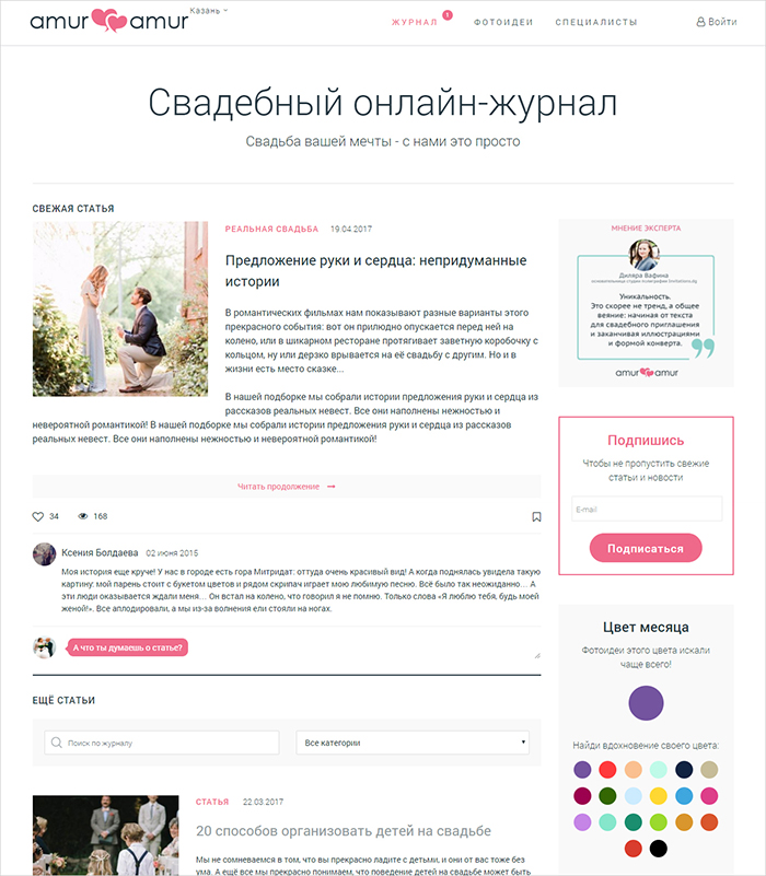
In the second version, it was decided to focus on articles since they were popular among visitors, and to make the design cleaner to avoid distracting readers from studying the material.
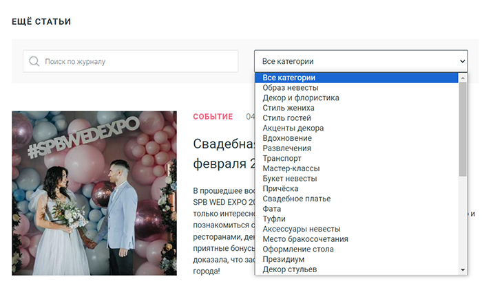
During the redesign, the homepage was merged with the “Magazine” section. For those who came seeking answers to specific questions, there is a search function for articles and category selection.
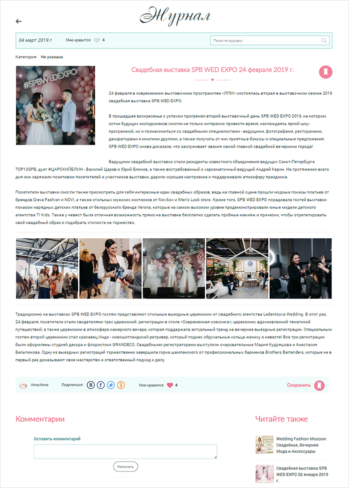
The article features a view counter, likes, and comments, as well as buttons for sharing the material — all familiar options for the user.
Photo Ideas
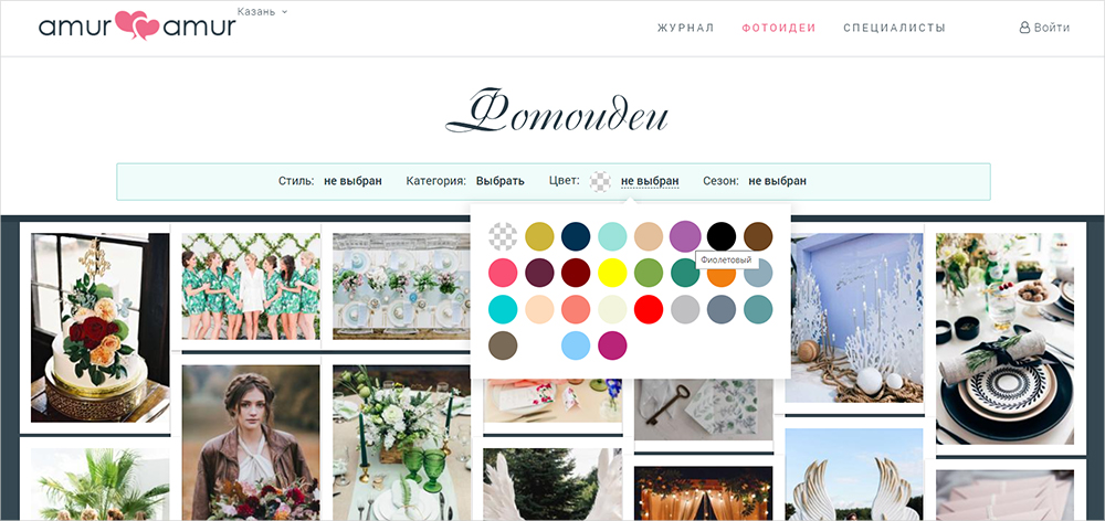
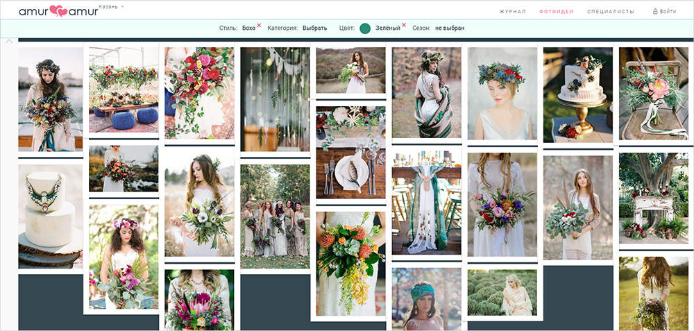
The “Photo Ideas” section was conceived as a highlight of the service. Here, future newlyweds can find inspiration for their celebration, understand which style and color they prefer, and also find solutions to specific requests.
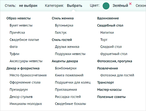
To do this, you just need to apply filters: choose the style and color of the wedding, season, category — if you need to find photos of a specific element, for example, the bride’s dress, photo zone options, etc.
When scrolling down, the settings are pinned to the top of the page and collapsed.
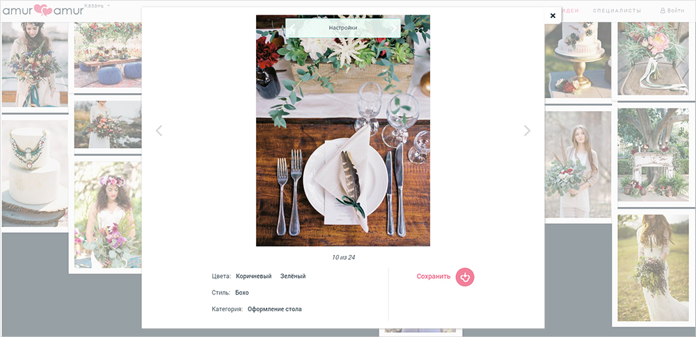
Each photo has its own parameters, which are set by the administrator when uploading the image. Liked ideas can be saved in bookmarks.
Specialists
The specialists’ directory will help you find wedding organizers, florists, makeup artists, photographers, and all other necessary participants of the wedding day.
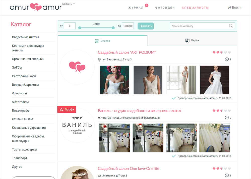
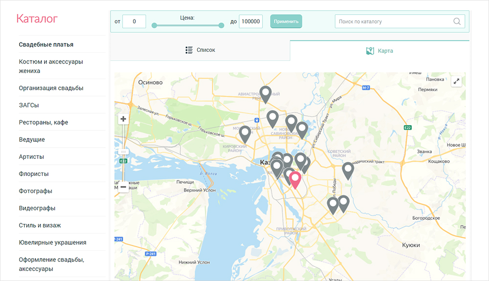
You can search not only by categories but also immediately filter by price — taking into account the cost of goods/services, or select companies by location on the map.
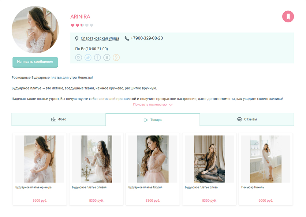
On the organization’s page, you can find detailed information, contacts, photos/videos, products with prices, and reviews — depending on the data filled in. You can also save the page in your account.
Events
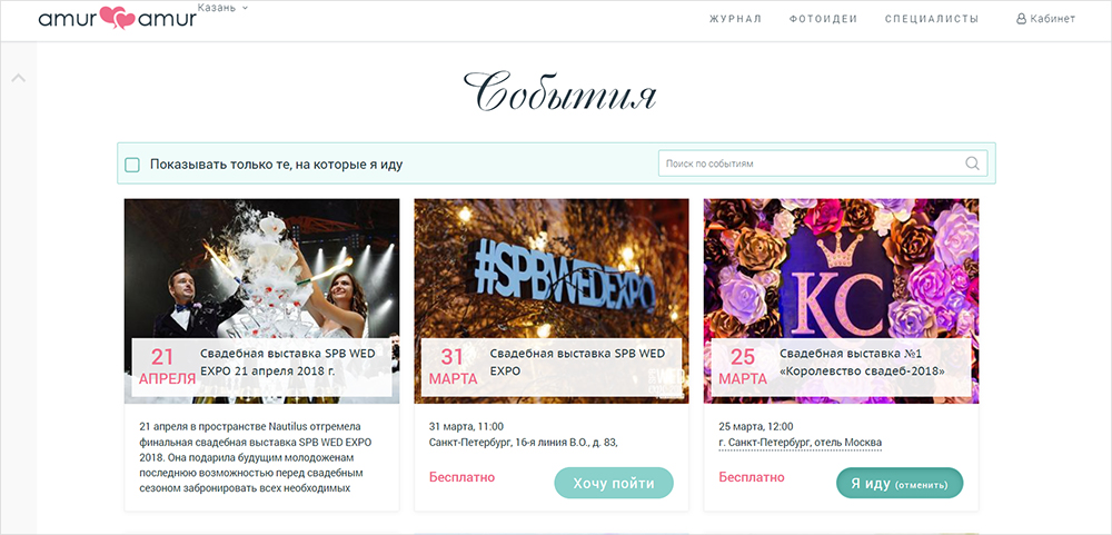
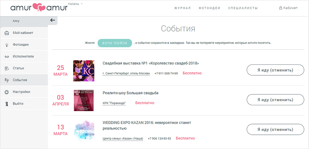
At the initial stage, the website also had an “Events” section with information about thematic offline events taking place in your city. Users could mark the meetings they planned to attend, so the service would remind them at the right time. In subsequent revisions, the events section was removed.
Bride/Groom Dashboard
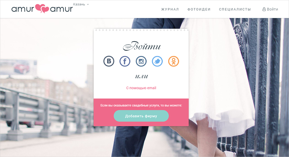
To access your personal dashboard and have the ability to save materials as favorites, you need to register on the portal and log in.
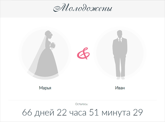
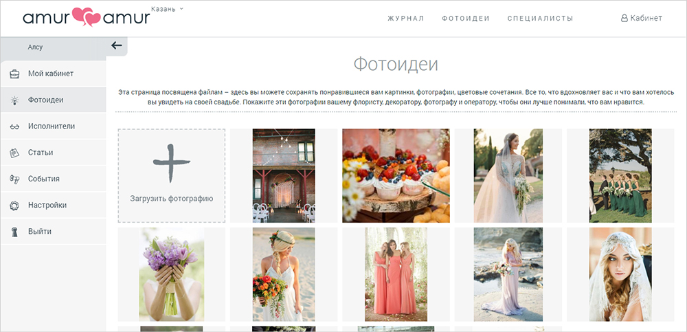
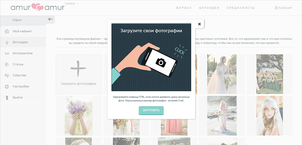
Here, you can view bookmarked photo ideas, articles, and vendors. Additionally, you can upload your own photos to keep a mood board in one place and, if necessary, share it with wedding organizers, decorators, etc.
Organization Dashboard
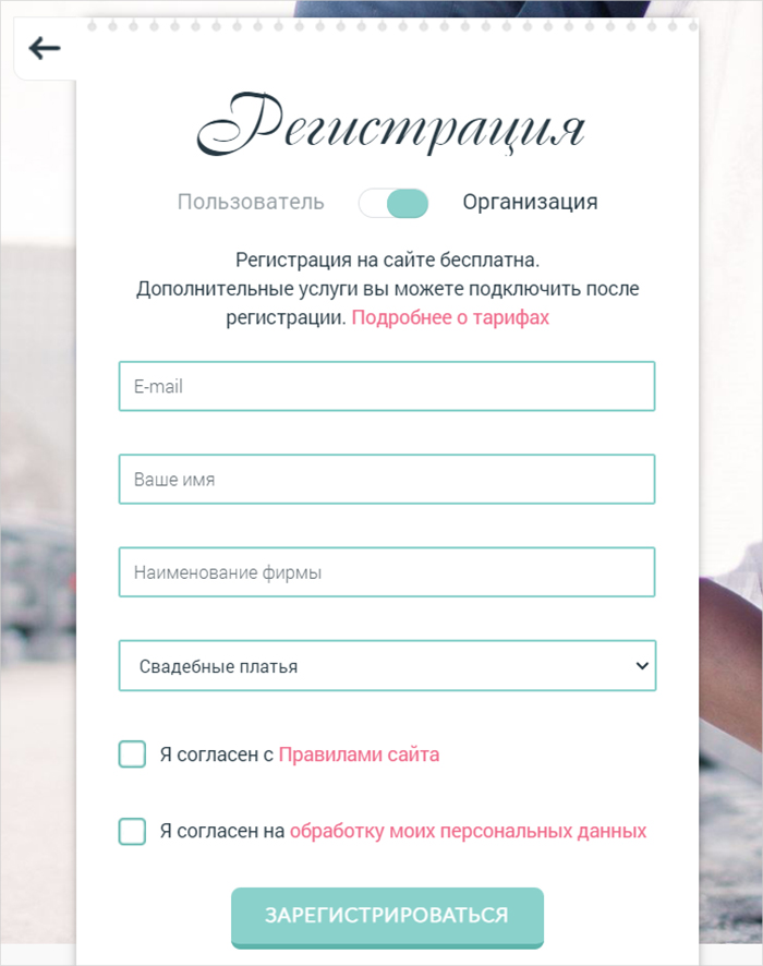
To access the catalog of wedding specialists, you need to register as an organization.
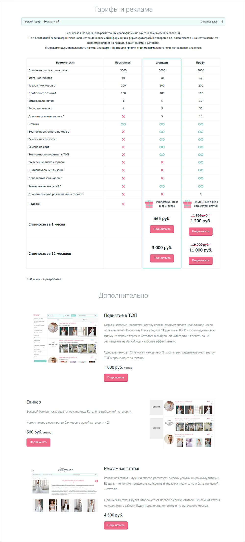
Registration is free, but there are paid tariffs and additional services that will help you stand out from competitors and get the maximum number of orders through the service.
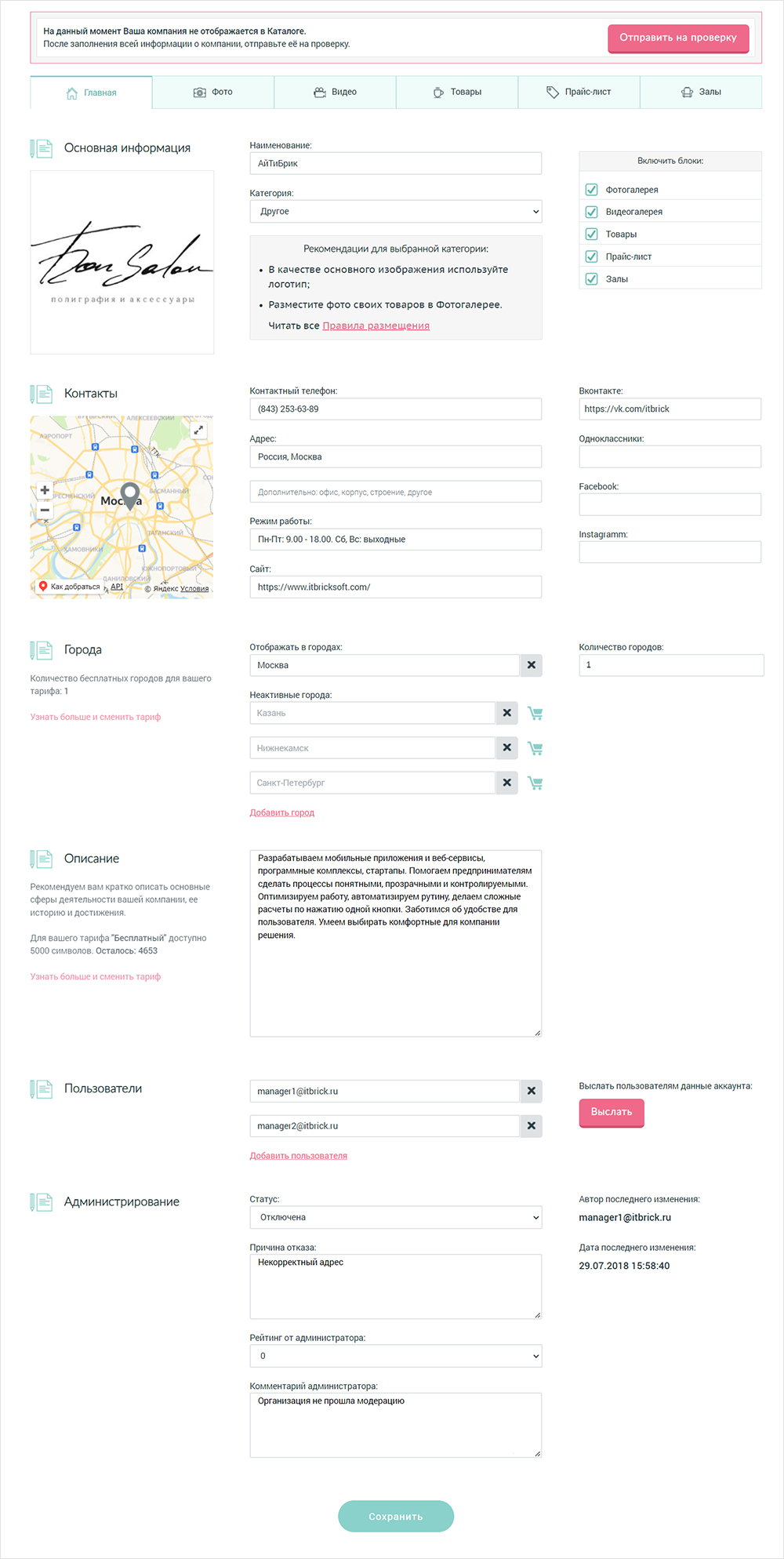
Next, you need to fill out the description and contacts, upload photos and videos, add products, prices, and submit them to the company for moderation. After verification by the administrator, the company either appears in the Catalog (in case of success) or is returned for data clarification.
The “Statistics” section gathers data on visits to the company’s page by users and provides advice on how to improve its rating.
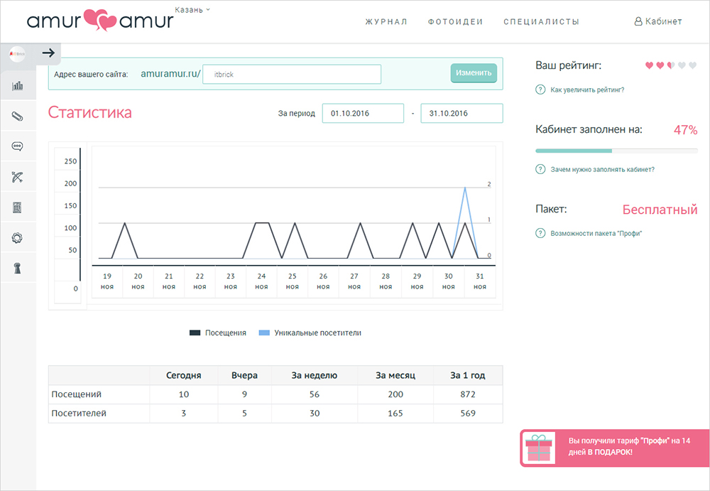
All paid features of the service can be viewed in the “Tariff” section. Payment history and automatically generated closing documents are stored in the “Payments” tab.
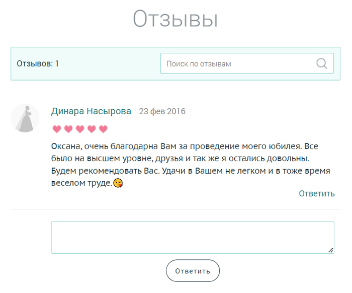
There is a “Reviews” section for working with user feedback.
Service Administration
To speed up work and save budget on the development of the web service, it was decided to make the Administrator Dashboard interface as simple as possible. Especially considering that the majority of the functionality consists of directories.
The following features are available to the administrator:
- Management of organizations: viewing, editing, enabling/disabling, working with ratings;
- Tracking recent changes in organization profiles and their moderation;
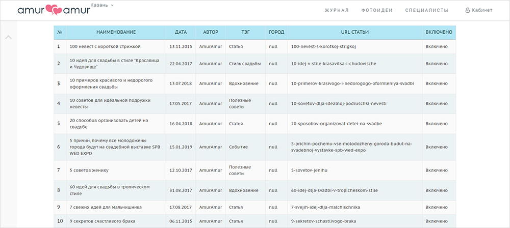
- Journal for adding articles and events,
- Uploading photo ideas,
- Tracking and moderating comments,
- Directories of tags, colors, styles, categories, users, etc.;
- Management of payments;
- Email newsletter: sending emails by categories (users, organizations, all) and/or by cities. You can send custom text or a set of articles and events.
Resume
Considering that high speed of implementation is important for a startup, we structured the software development process in such a way as to quickly obtain the first working version, and then gradually add additional features without stopping the service’s operation and without “breaking” the existing functionality.
As a result, just 3 months after the start of development, advertising was launched on the site and the first users were attracted. And within 6 months, it was fully operational, allowing all types of users to register and work independently.


