Task
To develop Android app that will make it easier to find smoothie recipes. The Administrator will add recipes: upload photos, fill in the description and category, specify the necessary ingredients.
Problem
The application is designed for 2 types of users:
- those who drink smoothies to achieve a certain goal (lose weight, cleanse the body);
- those who want to make smoothies with the ingredients at hand.
The development should take into account the needs of both.
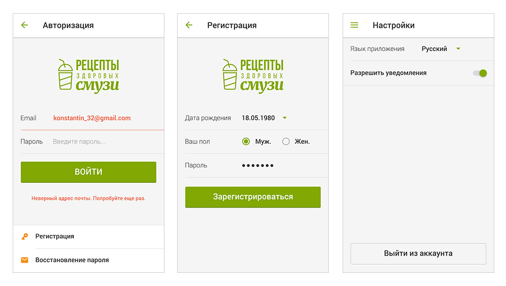
Another feature is that the application must be multi-lingual, i.e. the user chooses which language he/she wants to read the content in. First we have to introduce the Russian and English languages, later we will add others.
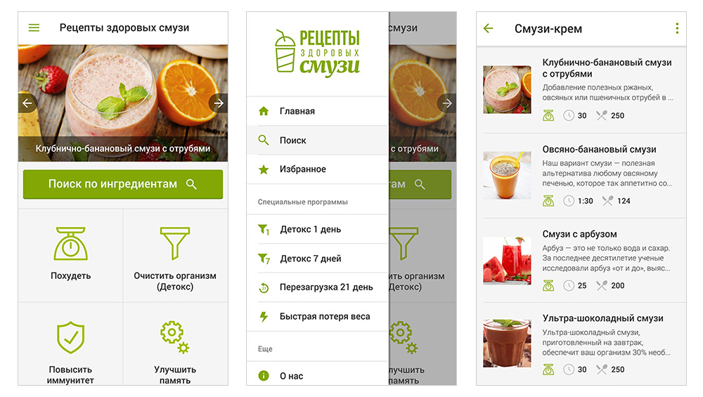
We chose a juicy green colour, which is associated with health, freshness and conveys the app message perfectly. Two versions of the logo were made: in Russian and in English. The app design was adopted at the first attempt without any improvements.
Solution
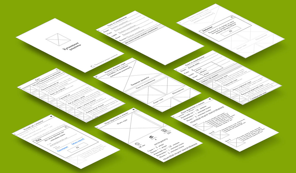
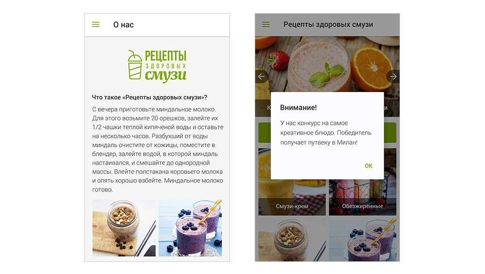
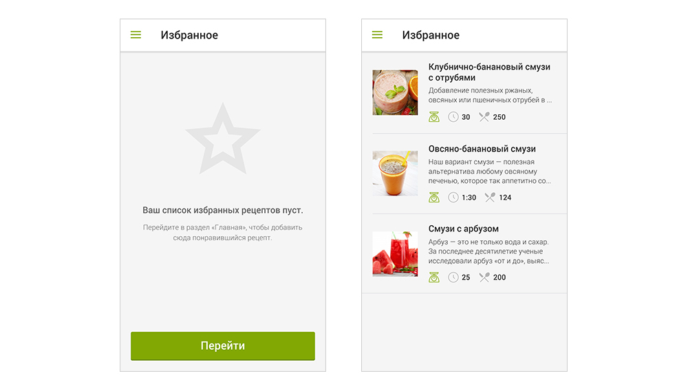
We have categorized recipes for easy navigation for those who came to the app to lose weight or improve their health. The menu also includes Special Programs — instructions for reaching your goal. The list shows the recipe energy and cooking time in addition to the category, which is very convenient!
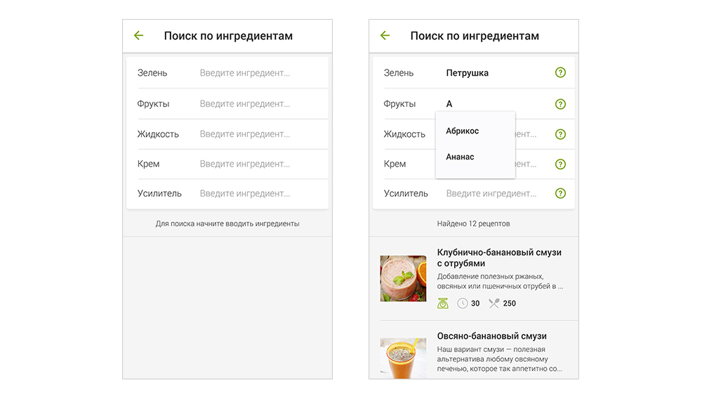
And if you want to make smoothies with what’s in my fridge, use the ingredient search.
The user starts typing the name and sees a pop-up hint with possible options. As a result, the app shows the recipes that contain the entered ingredients.
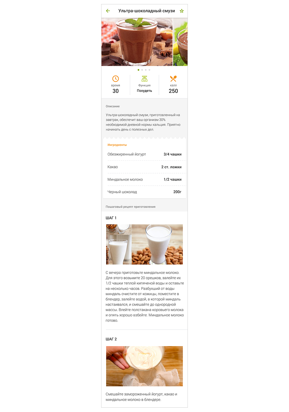
And this is what the recipe looks like. You can see at once what products you need. The step-by-step instruction makes it very easy to prepare smoothies.
Administrator Account
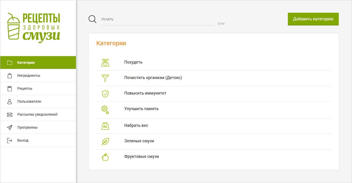
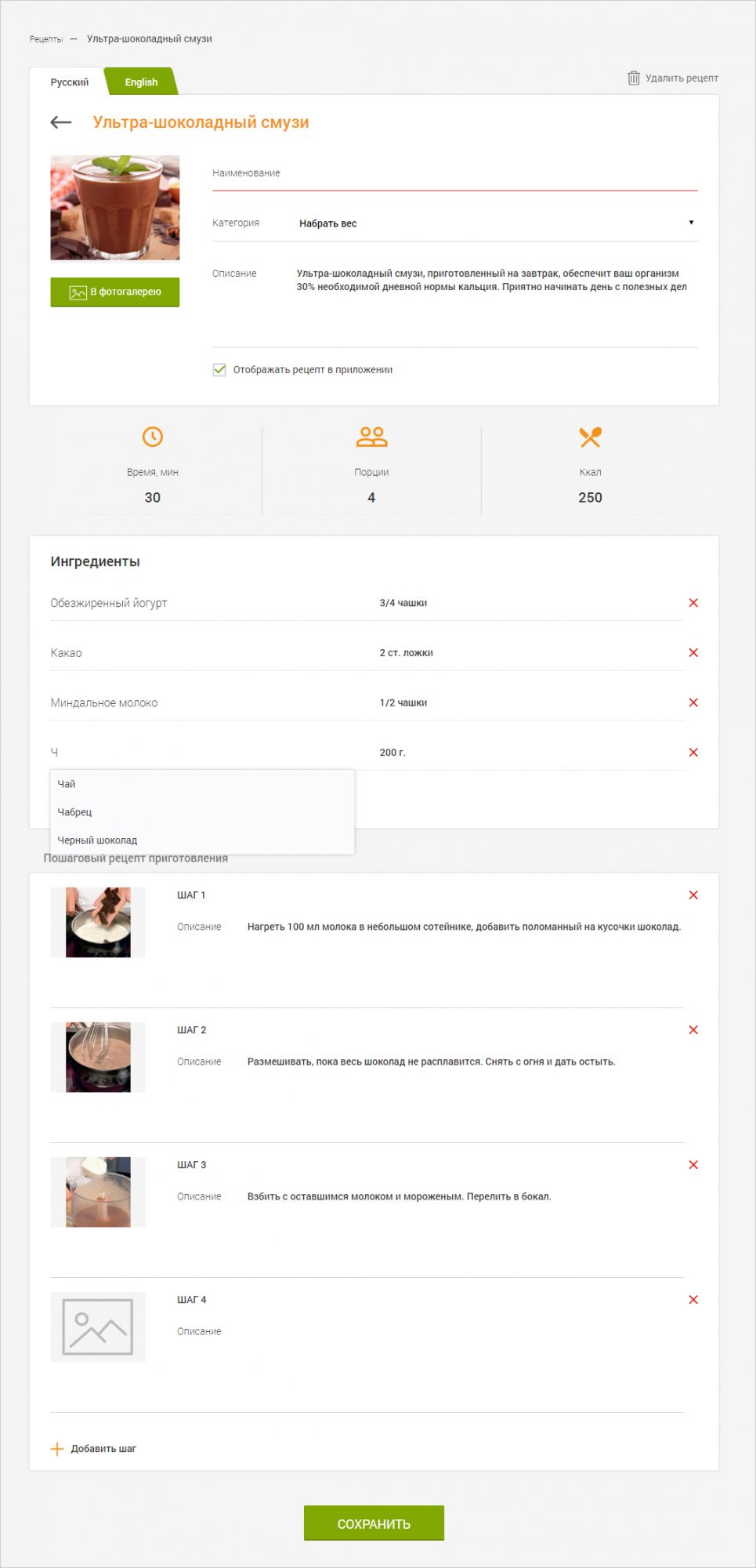
The administrator creates categories, adds ingredients and fills in information about special programs in the app web part.
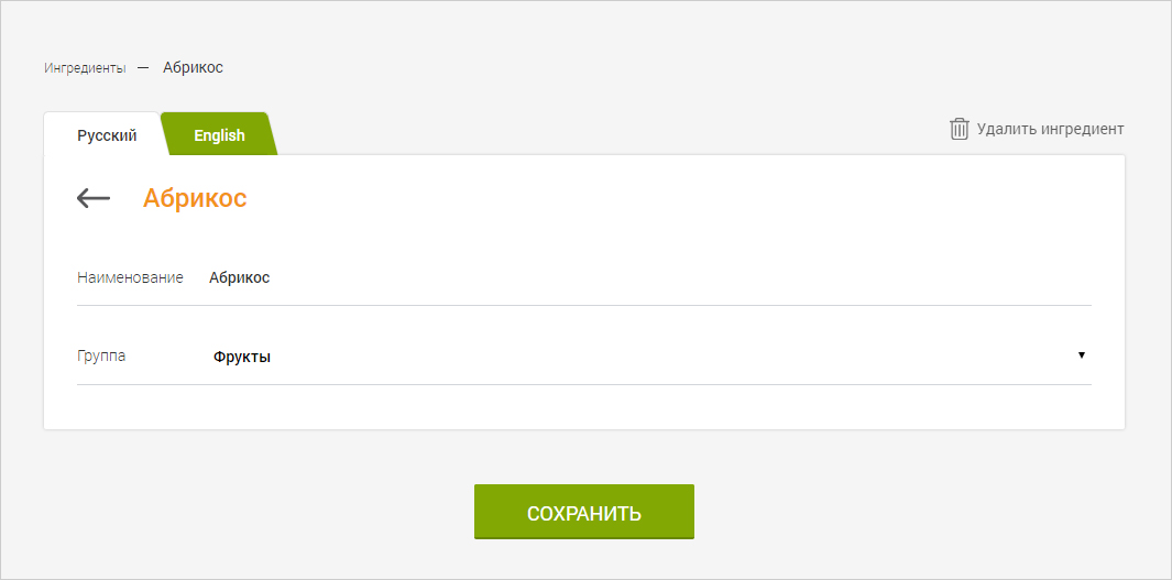
Content is filled in Russian and English. It will be easy to add a language in the future: a new tab for filling in will appear.
The page for creating a new recipe is simple and self-explanatory.
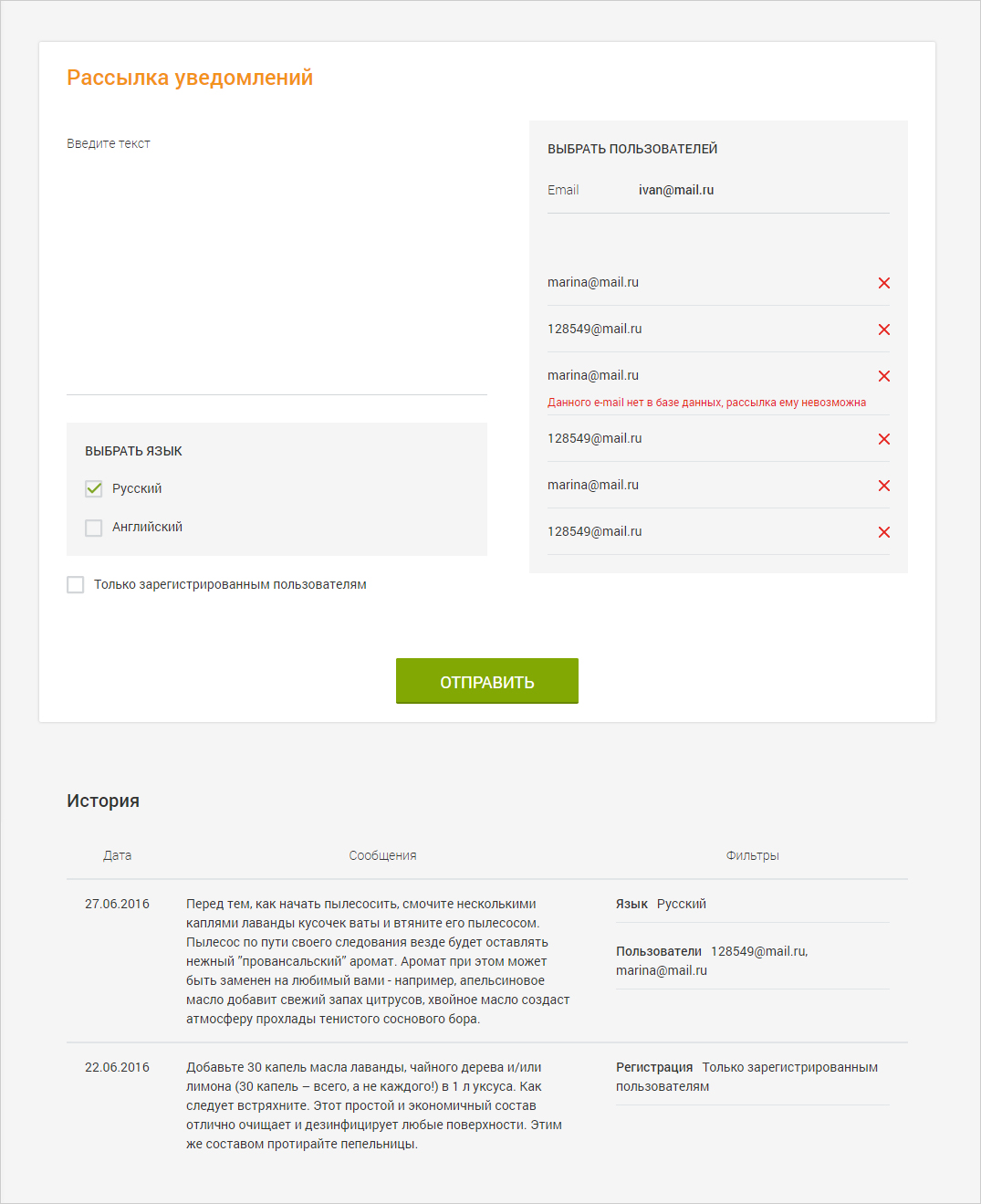
The administrator can create notifications and select a list of users to send out: all registered or specific users, separate those who use Russian or English version.

